Themebox - App icons, Widgets
- 4.7
- Rating
- 10.00M
- Installs
- Free
- Price

 Analysis by App-foxy
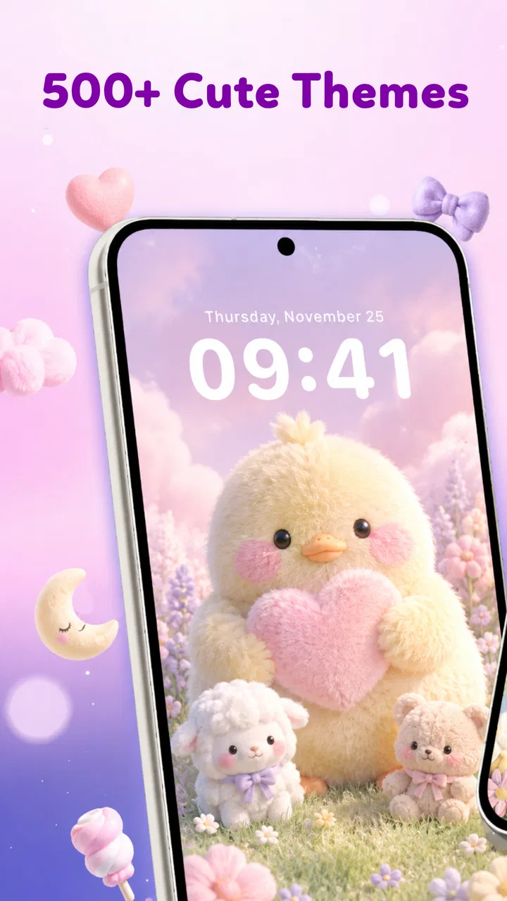
Themebox - App icons, Widgets is a personalization app from Fusion Flow Tech that I would describe as a visual refresh for people who want their phone to feel more deliberate. Its focus is not productivity or communication; it is the everyday experience of looking at and moving through a home screen. After spending time with it, I found the appeal easy to understand: a coordinated theme can make a familiar device feel calmer, more expressive, or simply less dull.
The app is free to start, rated for Everyone, and runs on Android 7.0 or later. It has reached over five million installs and holds a 4.7 average from around one hundred fifty thousand ratings, which suggests that the basic idea connects with a broad audience. I still think the important question is more personal: does changing icons and widgets genuinely improve the way you use your phone, or does it add another layer of visual fuss? My answer depends heavily on how much control, contrast, and consistency you need.
How the visual layout affects readability and navigation
The strongest part of Themebox is the way it treats the home screen as one visual composition rather than a collection of unrelated shortcuts. When icons, widgets, and the surrounding style work together, I can recognize groups of apps more quickly because the screen feels organized. That is particularly useful if you prefer a small number of pages and want your most-used tools to be easy to locate without relying entirely on tiny labels.
You May Also Like

 Blood Strike: 2.5 Anniversary
Blood Strike’s Loadouts Turn Every Drop Into a Tactical Gamble
A close look at Blood Strike’s custom loadouts: how fast access to signature weapons reshapes its battle royale rhythm, rewards preparation, and narrows the gap between fights.

 Pandora - Music & Podcasts
Pandora’s Music Is Easy to Start, but Harder to Recover
Pandora’s strength is its low-effort path from a seed to a station. Its weak spot is how much confidence it asks you to place in connection, setup, and quiet recovery.

 8 Ball Pool
 Is Built on Rivalries, Rematches, and Routine
A close look at the rivalries, rematches, shared routines, and unanswered safety questions that turn a quick pool match into a persistent mobile community.

 Samsung Music
’s Quiet Strength Is Playing What You Already Own
Its reach comes less from spectacle than from dependable access to a personal library. That simplicity is both the app’s strongest retention engine and its ceiling.

 AccuWeather: Weather Radar
AccuWeather Review: A Quick, Clear Forecast for Everyday Decisions
For everyday plans, the best forecast is the one you can understand quickly. AccuWeather makes rain timing, radar, and local conditions easy to act on, with a few trade-offs.

 Hill Climb Racing
Why Hill Climb Racing Still Turns Crashes Into One More Run
A tiny car, a bumpy hill and one more upgrade: Hill Climb Racing keeps resurfacing because its simple chaos makes every near-miss feel personal.
More From Our News Desk
View All News


At the same time, personalization can either improve or damage readability. Decorative icon designs may look polished in a preview but become less distinct when several similar shapes sit together. I found that simpler themes are usually better for navigation than highly detailed ones. If you often open an app in a hurry, a strong silhouette and clear color difference matter more than an elaborate illustration.
My practical advice is to choose the theme based on recognition first and appearance second. Before applying a complete style, think about the apps you open dozens of times a day: messages, maps, the camera, banking, and settings. If those icons become visually alike, the home screen may look more unified while taking longer to scan. Themebox works best when the design helps you build a visual map instead of forcing you to relearn every position.
Widgets add another layer to that decision. A widget can make information available at a glance, but it also occupies valuable space and can create a crowded first page. I prefer using one purposeful widget near the top or center, then keeping the most important shortcuts around it. This gives the screen a clear reading order and avoids the common mistake of filling every empty area simply because a theme makes it possible.
Navigation also depends on how much the design changes your habits. Someone who normally searches for apps may not benefit much from custom icons. Someone who uses a carefully arranged home screen may appreciate the visual cues. In my experience, the app is most satisfying when I treat it as a small redesign project: decide what belongs on the first page, remove distractions, then apply a style that supports that decision.
Making a theme easier to read in daily use
I would start with a light visual test rather than changing everything at once. Apply a theme, return to the home screen several times during a normal day, and notice whether you can identify the important shortcuts without stopping to inspect them. Morning light, a dim room, and a quick glance while walking all reveal different weaknesses. A design that looks excellent in a preview can be less practical when the screen is reflecting sunlight or your attention is divided.
Text remains important even when the icons are attractive. If labels become harder to distinguish, reducing the number of shortcuts on a page may help more than selecting a busier theme. I also found that grouping apps by task can compensate for icons that are visually similar. A page for communication, a page for travel, and a page for personal tools creates context that the artwork alone may not provide.
That is one of the app’s less obvious trade-offs: customization can make the phone feel more personal, but it can also replace familiar visual landmarks. I would not recommend changing the layout immediately before an important trip, a busy workday, or any situation where you need instant access to a particular tool. Give yourself time to learn the new arrangement.
Motor, sensory, and attention-related considerations
Themebox can support a more comfortable experience when the chosen design reduces visual clutter. A quieter arrangement may be easier for someone who becomes distracted by a busy screen, while a strong color hierarchy can help separate essential shortcuts from optional ones. These benefits come from thoughtful selection rather than from the app automatically adapting the interface to every user.
For people with limited visual attention, the number of decisions matters. I would avoid placing many widgets beside a complete icon pack, because each element competes for recognition. A restrained setup with a few frequently used apps is easier to scan than a full decorative makeover. The best result is not necessarily the most dramatic one; it is the one that lets you find what you need with less searching.
Users with color-vision differences should be cautious about relying on color alone. If two categories are separated only by shades that look similar, the arrangement may lose its usefulness. Pairing color with position, shape, and labels is safer. This is also helpful for anyone using the phone in low light or under glare, when subtle color differences become less reliable.
Motor comfort is affected by spacing and placement as much as by icon artwork. A widget placed where you frequently swipe can make gestures feel awkward, and a dense page may require more precise taps. I would keep high-frequency shortcuts within a comfortable reach and avoid filling the bottom area with small, tightly packed targets. Themebox can help you rethink the layout, but the final arrangement still depends on the launcher and device settings you use.
That distinction matters. The app is a personalization tool, not a complete accessibility suite. It can influence visual organization, but it should not be treated as a replacement for system options designed for larger text, magnification, stronger contrast, screen reading, or switch-based control. If those features are central to your phone use, I would test whether the customized appearance remains compatible with the settings you already depend on before committing to a full redesign.
Sensory comfort is another area where restraint pays off. A theme with intense contrast or a highly decorative widget may be enjoyable for a short look but tiring after repeated exposure. I prefer choosing a background and icon style that stays legible without feeling visually loud. The ability to personalize the screen is valuable precisely because it lets you avoid styles that make your device feel overstimulating.
A realistic everyday setup
Imagine checking your phone during a crowded commute. You have one hand occupied, the lighting changes between outdoors and indoors, and you need to open a transit app quickly. A successful Themebox setup would place that shortcut in a predictable, easy-to-reach position, use an icon that is distinct from nearby apps, and keep the surrounding area uncluttered. A beautiful theme with similar-looking icons and several competing widgets would be less useful in that moment.
For a quieter evening routine, the priorities change. You might place a clock or calendar widget where it can be read without opening an app, then move social shortcuts away from the first page. That arrangement can make the phone feel less demanding without requiring you to delete anything. I like this kind of situational design because it uses personalization to shape attention, not merely to decorate the screen.
Another useful workflow is to create a “low-friction” first page for essential actions and leave experimentation to a secondary page. That way, trying a new theme does not disrupt the shortcuts you rely on. It also makes it easier to compare styles honestly: you can see whether the new appearance improves recognition or only changes the mood.
Where the experience still has barriers
The biggest limitation is that visual customization is not automatically inclusive. A theme can be attractive and still make labels, symbols, or app identity harder to understand. People who depend on established system icons may find a completely redesigned set slower to learn. I would be especially careful if several household members share a device or if you regularly help someone else navigate the phone, because a heavily changed screen may create unnecessary confusion.
There is also a maintenance cost. Once you customize a home screen, new apps may not fit the same visual language, and changes to your daily routine can leave the layout feeling outdated. The more carefully arranged the screen becomes, the more time you may spend adjusting it. I do not see that as a flaw for hobbyists, but it is a real drawback for anyone who wants a set-and-forget solution.
The free entry point makes experimenting approachable, but optional purchases range from $3.99 to $19.99 per item. That range is worth considering before building your entire setup around premium-looking content. I would begin with the free experience and decide whether the visual improvement is meaningful enough to justify spending. If you only want a small change, paying for a large collection may not make sense.
Themebox was released on August 7, 2025, and its current version is 1.2.1. Those details are useful when judging expectations: the app is relatively new, so I would keep an eye on how smoothly it fits into your particular launcher and Android device rather than assuming every phone will behave identically. The minimum Android requirement is friendly to older devices, but compatibility in practice can still vary with manufacturer interfaces and personal settings.
I also would not choose this app if your priority is deep automation, advanced launcher controls, or a complete replacement for system-level accessibility tools. A dedicated launcher may offer more control over grid size, gestures, folders, and interaction behavior. Themebox is better suited to someone who wants a visual transformation without turning phone customization into a technical project.
Before applying a major change, I recommend taking a moment to remember your original layout. Even a quick mental note of where essential apps live can save frustration. Then change one element at a time: icons first, widget placement next, and background last. This makes it much easier to identify which part improves or harms your experience.
My inclusive verdict on Themebox
I enjoyed Themebox most when I used it as a tool for reducing noise and clarifying priorities. Its value is not simply that the home screen can look different. The better use is to create a layout that matches the way you actually reach for your phone, whether that means a calm first page, a high-contrast arrangement built around distinct shapes, or a compact set of shortcuts for quick one-handed access.
Fusion Flow Tech has made an app that should appeal to people who want personalization without needing to design every element from scratch. The strong rating and large install base show that the concept has found an audience, but popularity does not remove the need to test readability for yourself. A theme that works beautifully for one person may be tiring or confusing for another.
My recommendation is to prioritize recognition, reach, and comfort over visual novelty. Start with a simple arrangement, keep essential apps in predictable positions, and treat widgets as functional tools rather than decoration. If a style makes you pause before opening a familiar app, it is not serving you well, no matter how polished it looks.
For users who enjoy refreshing their phone and are willing to spend a little time tuning the result, Themebox - App icons, Widgets is an appealing free personalization option with room for experimentation. It is less convincing for anyone who needs guaranteed accessibility behavior, extensive launcher controls, or a completely maintenance-free home screen. I would try it, but I would judge it by the ease of reaching your essentials after the novelty fades.
In the end, the most inclusive setup is the one that respects different contexts: bright or dim environments, quick glances or careful browsing, familiar routines or changing needs. Themebox gives you useful visual building blocks for that process, but the thoughtful decisions remain yours. That balance is both its strength and its main limitation.
FAQs for Themebox - App icons, Widgets
01What is Themebox and how does it work?
Themebox is an app designed to personalize your device by offering a wide variety of app icons, widgets, and themes. It allows users to customize their home screen aesthetics easily. Once installed, you can browse through different themes and apply them with just a few taps, giving your device a fresh, new look.
02Is Themebox compatible with all devices?
Themebox is compatible with most Android and iOS devices. However, some features might be limited based on the device’s operating system version. It's important to check the app's compatibility information on the download page or in the app store to ensure it works seamlessly with your device.
03Are there any costs associated with using Themebox?
Themebox is free to download, but it offers in-app purchases and subscription options. These purchases may include premium themes, widgets, and icons that can enhance your customization experience. Users can choose between a free, ad-supported version or opt for a subscription to access exclusive content and an ad-free interface.
04How can I troubleshoot if Themebox is not working properly?
If Themebox is not functioning correctly, start by checking your internet connection as the app requires it to download themes. Restarting your device can also resolve minor issues. Ensure that the app is updated to the latest version, and if problems persist, contact Themebox’s support for further assistance.
05Is it safe to use Themebox on my device?
Yes, Themebox is safe to use. It is available on official app stores, which means it has passed security checks. However, as with any app, it's important to download updates promptly and be cautious of permissions you grant. Always check user reviews and ratings for additional assurance.
Pros
- Highly customizable app icons and widgets.
- User-friendly interface for easy navigation.
- Regular updates with new themes.
- Compatible with most Android and iOS devices.
- Supports integration with popular apps.
Cons
- Some features require in-app purchases.
- Occasional bugs with certain themes.
- Limited free themes available.
- Widgets may not sync perfectly on all devices.
- Requires internet for theme downloads.

Themebox - App icons, Widgets
Gallery